Physically Based Rendering (PBR) in Lightwave

Again and again one finds incomplete, inaccurate or wrong descriptions of the PBR workflow in Lightwave 2020.
Unfortunately, you won't find much background knowledge about this in the manual either. That's why I want to try to shed some light on the matter.

Here's the thing: of course everyone can work the way they want and if it fits there is no wrong way. This is not intended to be a textbook about PBR but to describe its use specifically in Lightwave (there are many good papers on PBR on the Internet, also about the advantages of PBR).

I won't go into too much detail for now. This is not necessary to work with it because the workflow is very easy. The first post is only about the proper setup of a readymade PBR material in Lightwave. More background knowledge will follow in later posts.

PBR isn't a standard, it's more of a guideline. The rules mentioned here mainly follow the guidelines of Allegorithmic (maker of Substance Designer and Substance Painter). But most people follow them anyway.
 
Set up readymade texture sets for Physically Based Rendering (PBR) in Lightwave

Mainly there are two different workflows for PBR: the specular/glossiness workflow and the metallic/roughness workflow. Lightwave uses the metallic/roughness workflow (we do not have an official statement on this but it is obvious).

An underlying concept of PBR is to define all parameters of the material with textures. Although we can use values as a alternative. That means we first need a suitable texture set for the metallic/roughness workflow. You can find many of them on the internet.

PBR_maps_01.jpg

In the metallic/roughness workflow you need at least a color map, a roughness map and a metallic map. Mostly there is a normal map, often also a bump and displacement map. Sometimes there is also an ambient occlusion map (this is mainly used in game engines and realtime rendering, as it is supposed to imitate/support global illumination. Of course you can also use it in Lightwave...). If necessary, we also need other special maps such as sub surface scattering color and the like.

To clear up a common misunderstanding right at the beginning: metallic/roughness workflow can be used for all materials not only for metals (the same applies to specular/glossiness workflow).

In order for PBR to work properly in Lightwave, there are a couple of basic things to keep in mind. First we need a correct color management. For now, unless you know exactly what you need, you can just use the sRGB preset in the Preferences > CS tab.

PBR_CS_01.gif

This tells Lightwave how to interpret the various color inputs and how to output the rendered colors (e.g. for display on the monitor).

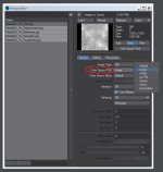
Now we can load our texture maps by dragging them into the image editor. Because of our color management setting in Preferences, Lightwave interprets all loaded 8-bit images as sRGB (which is appropriate for 8-bit images with color information). For the texture maps that represent a value (e.g. how rough is the surface) we need to change the Color Space RGB setting in the Image Editor from Default (here it means sRGB) to Linear. These are: roughness map, metallic map, normal map, bump and displacement map.

PBR_Image_Editor_01.jpg

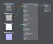
Now we can use the texture maps in the node editor of the Surface Editor. As material we use Principled BSDF (not the Standard material, it is not suitable for PBR). In the node editor we can hook up the images. I'm now assuming that anyone can set up an Image node.

PBR_Nodes_01.jpg

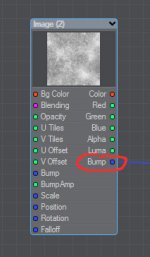
Please note: use the NormalMap node for normal maps (don't use the Image node). And use the Bump output of the Image node for bump maps.

Bump_output_01.jpg

Done!
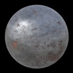
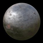
For now, let's leave the other settings, like Specular or Refraction Index, at their default values.

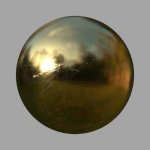
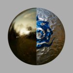
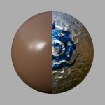
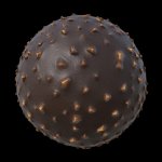
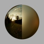
Kugel_01jpg.jpg Kugel_02.jpg

With the default Gradient Backdrop and with an HDR image.


Note: For special materials, we have other properties such as Transparency, Translucency, Sub Surface Scattering, Luminous and more.

That's it for now, we want to keep it easy.

ciao
Thomas
 
Last edited:
Ok, so just to re-enforce what Thomas has said. I think it's very important to emphasise that his post is specifically focusing on how to use third party pbr textures with LightWave, and not about how to use LightWave's surface editor to create pbr surfaces and textures.

I only mention this because I had to re-read his explainer in order to get a better understanding his approach since I have never used third party pbr textures, so this is new news to me and as a result found what he was saying somewhat confusing.

Now that I've realised that he's specifically focusing on the workflow for the importation of third party pbr textures, it makes more sense. So I thought, for all those who, like me, became a bit confused, I'd try and clarify his intention.

Sorry for the confusion. Yes, the first post is only about the use of third party PBR texture sets in Lightwave.
Further posts will also cover other aspects of PBR in Lightwave. And some may appear even more confusing than the first one. The very next one has great potential for this. :)

But in fact I want to achieve the opposite. So: ask if something is not clear.

ciao
Thomas
 
And not all PBR textures are made equal.

For example: https://www.sharetextures.com/textures/metal/metallic_blue

The unsuspecting soul would use these maps (of which there are five) in the way @Thomas Leitner describes above. But these consist of only 1 value.

The normal map contains no variation in data. The base colour of one blue value fills the entire texture map. The height map is neutral gray only. Only the roughness map shows a tiny bit of variation, but at 8bit the values shift only between 48-50 RGB.

In short, it is a complete and utter waste of memory, resources, and file space to use this "PBR" texture. All maps contain a single value but for the roughness map (which is too subtle to notice in a typical render anyway).

In these cases it is an utter waste of a PBR texture. The same material can be created by merely sampling the base values from the roughness, metallic, and colour maps in an image editor, and setting those values in the equivalent Principled Shader settings.

In short: check the PBR texture maps before assigning them mindlessly. In particular with GPU rendering it may save tons of resources during rendering.

Addendum: in a sample scene of mine the difference in GPU memory usage while rendering is 100MB when I use simple copied values for the metallic, colour, and normal settings instead of using those wasteful 4K maps. Only the roughness map had a very subtle streaking in it, and I left it.

So: ~900mb versus ~800mb after this simple change. No difference in render result for that material.
 
Last edited:
The roughness glossiness thing

In many texture map sets we find a glossiness map, what is it for?
Like the specular map, this is part of the specular/glossiness workflow (assuming it's a correct PBR texture set).
We can't just use the maps in Lightwave like that (as already mentioned, lightwave uses the metallic/roughness workflow).

PBR_maps_03.jpg

Note: The name for the specular map sometimes differ (e.g. reflection).


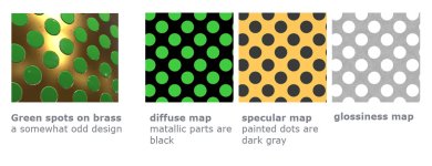
Diffuse, specular and glossiness: all the names seem familiar to us from the old Lightwave Renderer (before LW 2018) but are different in the specular/glossiness workflow (ok, glossiness by itself is still the same).

However, diffuse and specular maps differ completely from the old material properties. Both store RGB values (yes, the specular map also has color information and the Principled BSDF node has no input for it).

The specular map contains on the one hand the F0 (Fresnel Reflectance at 0 Degrees) for non-metals (if you really want to know what this is look at the end of this post) and on the other hand the reflectance values for metal (a color).

The diffuse map is only albedo color. The areas that indicate raw metal will be black (RGB 0/0/0) as metal doesn’t have a diffuse color.

It could look something like this:
Gloss-Spec_maps_01.jpg

Therefore we cannot use these maps directly.

If the material contains both (i.e. a mixture of dielectric and metal, e.g. rusty metal) you have to rebuild the textures in a photo editing program to fit the metallic/roughness workflow (Maybe we'll look at that later).

All non-metals can easily be adapted to the metallic/roughness workflow within Lightwave. We remember: we need a color, a roughness and a metallic map.

The diffuse map should be the same as the color map in the metallic/roughness workflow (if no metal is involved). We can use it as it is and plug it into the Color input of the Principled BSDF node.

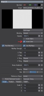
The glossiness map represents the gloss of a surface, but Principled BSDF has no glossiness input. However, glossiness is the inverse of roughness.
So, to some extent, we can use it directly in Lightwave. To do this, we invert the glossiness map in the Image node and can now plug it into the Roughness input of the Principled BSDF node .

Gloss_invert_01.jpg

The metallic map indicates what is metal and what is non-metal. For a non-metal it is black. We don't need a map at all and just leave the default value for Metallic at 0%.

Metallic_01.jpg

And the specular map? We don't use it. We don't need it. We leave the value for Specular at 50% (there is a really good reason for this, which we will see in the very next post).

Done.

Gloss_convert_openGL_01.jpg

Note:
Other maps such as normal maps or bump maps do not differ and can be used in the same way in both workflows.

ciao
Thomas

p.s.:
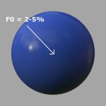
F0 (Fresnel Reflectance at 0 Degrees) means: the amount of light (in %) a material reflects exactly in the direction of the observer, taking into account the Fresnel effect and therefor the refraction index of the material.
For common non-metals, this value is between 2 and 5%. But we are not really interested in that (yet). :)
 
Last edited:
The Specular Setting in the Principled BSDF node

We haven't changed the specular setting yet, it still has the default value of 50%. But that can't be right, at least metal certainly reflects more than 50% of the light. What's going on?

Gold_01.jpg

We have to differentiate between the reflections of non-metals and metals.

Reflections of non-metals:
When the shader sees black in the metallic map, it treats the corresponding area in the base color map as non-metal and uses a 4% reflectance value at F0. Automatically!

But not all dielectrics have an F0 of 4%. This can range from 2 to 5% and even reach 8% for gemstones. Therefore we can change the F0 with the Specular value in the shader. The 0-8% reflectance at the F0 is remapped to 0-100% Specular in the Principled BSDF node.

In fact, the physically correct Specular value for common dielectrics in the Principled BSDF node is between 25 and 62.5% (except gemstones).


Plastik_03.jpg

One of the great things about the PBR workflow is that the Fresnel Effect (the amount of light reflected from a surface depends on the viewing angle at which it is perceived) is automatically taken into account.

Reflections of metals:
The strength of the reflection of metals is determined by their color values in the color map combined with the value of the metallic map.

Actually, a metallic map would only contain black (non-metal) or white (metal), but in order to be able to display dirt and other overlays, intermediate values are also possible. As a general guide, the grayscale range for raw metal will be defined as 235-255 sRGB in the metallic map.


You can try this simply by changing the Specular value with a 100% metallic material: the reflection will remain the same. The Specular setting has no effect.

specular_01.gif
Only the reflection of the non-metal changes slightly, that of the
metal remains the same.


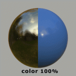
On the other hand, you can regulate the strength of the reflection for a metal with the color setting.

color_01.gif
We dim the color setting. The reflection of the non-metal does
not change, that of the metal changes.


By the way, how specular is handled is one of the biggest differences between specular/glossiness workflow and metallic/roughness workflow.
In the specular/glossiness workflow you control the strength of the reflection directly with the specular map. But that also means that you can use incorrect values.

ciao
Thomas

p.s.:
F0 (Fresnel Reflectance at 0 Degrees) means: the amount of light (in %) a material reflects exactly in the direction of the observer, taking into account the Fresnel effect and therefor the refraction index of the material.
 
Last edited:
Normal maps in Lightwave

When working with PBR workflow you will soon realize how important the roughness map is for a realistic result. The similar is true for the normal map. It gives us detailed bumps and cavities with no real geometry. We've had it in Lightwave for a long time and it's not particular to the PBR workflow, but there are a few things to keep in mind.

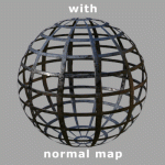
Gitter_01.gif

Most of the time we use tangent space normal maps. They work with moving and deforming objects. And almost all texture sets come with this type of normal maps. Other types such as world space or object space normal maps are less common. Here (wikipedia) you can read more about it.

Tangent space normal maps can be identified by their dominant purple color. :)


There are two different common formats of normal maps, one for DirectX and one for OpenGL. Both have the same capability, only their green channel (represents the Y axis) is inverted to each another. If one uses the mismatching ones, dents appear as bumps and vice versa.

DiamondPlate_Normal_DirectX.jpg DiamondPlate_Normal_OpenGL.jpg
Sometimes a texture set contains both types. We can recognize the OpenGL normal map because
it looks more correct to us (elevations already looks as elevations in the map).


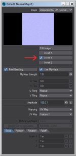
Lightwave uses OpenGL normal maps by default. You can use a DirectX normal map if you invert the Y axis in the NormalMap node.

Invert_Y_01.jpg


Note: The Color Space RGB setting (Image Editor) for Normal maps must always be set to linear.

PBR_Image_Editor_01.jpg

ciao
Thomas
 
Last edited:
Nativ Color management in Lightwave
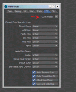
PBR_CS_01.gif

In the first post we simply used the sRGB preset in the CS tab in Preferences. Now let's take a closer look.

Lightwave was one of the first renderers to have color management. However, even before we could use a correct linear workflow in LW 9 with some manual work. :)

Lightwave Renderer renders in linear color space.
This means that the color space has a linear gamma. However, all common images and monitors are in sRGB (in the professional field there are others like Rec 709) and therefore a logarithmic gamma. This is a result of adapting to human vision and technical possibilities.

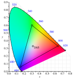
The second part that defines a color space is gamut. Gamut is the range (exact: a 3D shape in color space) of colors that can be represented in a specific color space. That means, for example, that some colors cannot be displayed on a common monitor.
495px-CIE1931xy_sRGB.svg.png
sRGB gamut is the small triangle. (BenRG, Public domain, via Wikimedia Commons)


If you use sources with color spaces with different gamuts and gammas, then you should all convert them to a linear one with the same gamut.
This is exactly what Lightwaves color management does. In the CS settings we define the color space for each source and each output.
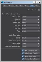
PBR_CS_03.jpg

A detailed look at the settings:

Convert Color Space to Linear
The first section contains the adjustable sources for color input. Here we select the color space that each source has.
The individual sources are basically self-explanatory.


8-bit Files
One of the most common color sources is 8-bit files, i.e. images with 8 bits of color information per channel, also known as 24-bit (3 x 8 bit for RGB) or 32-bit (RGB & Alpha) images. These include the common formats jpg, png and tga.
These formats usually have an sRGB color space (rarely in the 3D texture area there are others such as AdobeRGB). That's why we choose sRGB.

If we now load an 8-bit image in Lightwave, it will automatically be treated as sRGB in the Image Editor.

If necessary, we can make individual settings for individual images in the Image Editor at any time. This is exactly what we have to do with 8 bit images/textures that represent data and not colors (e.g. roughness, normal, metallic and similar maps). Also video footage can be Rec 709, for example.


Float Files
Floating point image formats are also very common. They can contain much higher dynamic range than 8-bit images. These include the common formats exr, hdr and tiff (not the 8-bit tiffs).
We mainly use them for lighting, but they can also be useful as a displacement or elevation map. Common floating point images are linear, which is why we select Linear.

If we now load an floating point image in Lightwave, it will automatically be treated as linear in the Image Editor.


Picked Colors/Light Colors
Picked Color affects all color pickers in Lightwave except Light Color (which has its own setting) and Backdrop color, which always seems to be in linear color space.
With LW 2018 the sRGB preset was changed. Since then, Picked Colors and Light Colors are set as Linear (previously as sRGB).
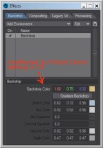
Backdrop_01.jpg

Which setting you prefer here you have to decide for yourself.
If you use color values for certain materials from the Internet, you may have to convert the values to the color space used. These are often in sRGB but sometimes also in linear color space.

However, if you use the sRGB setting, the vaules of the colors corresponds to that of the images (and also largely to our perception).

The same applies to Light Colors.

Note: If you save a Surface, just the RGB values are saved. The color space setting is not saved. With other color space settings, reused surfaces are no longer interpreted correctly.
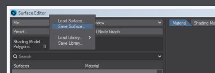
Surface_01.jpg


Apply Color Space
The second area contains the adjustable color outputs.


Display
This setting affects VPR, Image Viewer and OpenGL (if Color Correct OpenGL is checked) rendering. For a common monitor we choose sRGB. However, you can also change the display color space in the Image Viewer at any time for each individual image.


Default Final Render
Sets the Color Space settings for final render in the Output tab of the Render Properties. Depending on the desired output format, we select the appropriate color space here.

Render_Output_01.jpg

In a professional workflow, the output is always in a floating point format. As a result, the entire color information is retained and can be converted to the final format in a color grading, compositing or photo editing program (the preferred format is exr).

When converting from linear to sRGB, information is lost, which also means that you have to make a decision about what is lost. This process is called tone mapping. Lightwave also applies tone mapping when using a setting other than Linear. However, this simply corresponds to a "technical" conversion without artistic or other aspects and without the possibility of intervention.

That's why you shouldn't actually render to sRGB. Anyone who still wants or needs to output in sRGB should take a look at the Tonemap Pixel Filter. This gives you some control over the mapping and is also displayed in VPR.

Tonemap_01.jpg Tonemap_02.jpg


Default Buffer/Embedded Alpha Channel
Alpha and Render Buffer should be set to Linear. You can change individual buffers in the Output tab of the Render Properties if you know what you're doing.


It should also be mentioned that look up tables (LUT) can also be loaded in all color space settings. This can be useful for preview purposes when there is already a special look for a project (loaded into Display). Color grading artist can provide a exported LUT.
LightWave has the ability to load *.csp, *.3dl and *.cube LUTs.

Of course, all of this applies not only to PBR workflow but also to earlier Lightwave versions.

ciao
Thomas
 
Last edited:
Why you really shouldn't use default sRGB output

Schoko_01.jpg
One chocolate with nuts using default sRGB rendering output and an environment light with default Backdrop.

Schoko_02.jpg
One chocolate with nuts using tone mapping ACES Filmic and an environment light with default Backdrop.


And next I replaced the default gradient Backdrop with HDR images:

Schoko_03.jpg
One chocolate with nuts using tone mapping ACES Filmic and an environment light with HDRI outdoor.

Schoko_04.jpg
One chocolate with nuts using tone mapping ACES Filmic and an environment light with HDRI indoor.

ciao
Thomas

p.s.: This is simply a quick test with a slightly displaced ball and a PBR texture set. It should show the second best way, color grading in another program is of course still preferable. Sorry for the sloppy UV mapping. :)
 
for realism the result of sRGB / linear surely is important to study.
...and important to be aware of dynamic range as well. It is useful to check your render's dynamic range via a false colour to check if your render is taking advantage of the full dynamic range and is neither under- (n)or over-exposed, because it limits the options in post / compositing.

I find the false color check useful to check for under and/or over exposure. For example:

false_color.jpg

color.jpg

Also good to realize that the debat about ACES vs Filmic is somewhat useless, since neither are perfect and have flaws. Use what your / the client's pipeline requires/wants. Onward to AgX? (I am no expert ;-) )

PS the chocolate texture files I traced back to https://www.texturecan.com/details/227/
 
PBR real-world values and basic guidelines: Metal

If we're building a metallic material from scratch, there are some rules to consider (unless it's going to be an alien metal). All values mentioned here have been measured on real-world materials. Of course, they should only be given as a guide and starting point.

In the Principled BSDF node, we use the Metallic setting to define whether the material is non-metal or metal. As already mentioned, a metallic map can be not only black and white but also greyscale to create dirt and other overlays.
For raw metal, this value is between 235 and 255 sRGB in an texture map. Since we interpret metallic maps linearly, this means that we have a range between ~92 and 100% metallic.

Attention:
We actually have not to convert from a logarithmic (sRGB) to a linear gamma here. We can just do the math: 235 is ~92% of 255.

At 92% metallic, the metal is already tarnished. However, if you reduce metallic more, you should also reduce reflectance (Color).
Raw metal need to have a reflectance range of 70-100% reflective in Color (180-255 sRGB).

Some examples:
Gold sRGB (255/226/155)
Silver sRGB (252/250/245)
Aluminium sRGB (245/246/246)
Iron sRGB (196/199/199)
Copper sRGB (250/208/192)

Of course, in real life we often deal with alloys. Use that as a starting point.


Let's mess around a little:
Note:
I set my Color Picker in CS (Preferences) to sRGB.


BSDF_001.jpg
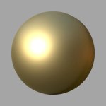
I set Color Setting to Gold sRGB (255/226/155) and Metallic to 100%.

BSDF_002.jpg
I add the Tonemap Pixel Filter for better grading.

BSDF_003.jpg
The material is very rough (50% roughness). I set the roughness to 2%.

BSDF_004.jpg
I add a little bit turbulence texture to the bump input to add some tiny imperfection.

BSDF_006.jpg
I add a roughness texture to add some scratches.

BSDF_007.jpg
I add a normal map to add some dents. The rough material almost looks like gold paint.

BSDF_008.jpg
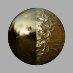
With another Normal map, the rest is the same, it gets a different appearance. By the way, I'm using a normal map of crumpled paper here. :)

BSDF_009.jpg
I set Color Setting to Silver sRGB (252/250/245). Okay, almost

BSDF_010.jpg
I set the metallic value to 0% and use a chocolate color sRGB(110/85/69). The roughness is higher but the scratches also look good on chocolate.

BSDF_011.jpg
I add some Surface Displacement.


Did you know that you can only attach 10 images per post? Well then, that's it for now.

ciao
Thomas
 
PBR real-world values and basic guidelines: Metal

If we're building a metallic material from scratch, there are some rules to consider (unless it's going to be an alien metal). All values mentioned here have been measured on real-world materials. Of course, they should only be given as a guide and starting point.

In the Principled BSDF node, we use the Metallic setting to define whether the material is non-metal or metal. As already mentioned, a metallic map can be not only black and white but also greyscale to create dirt and other overlays.
For raw metal, this value is between 235 and 255 sRGB in an texture map. Since we interpret metallic maps linearly, this means that we have a range between ~92 and 100% metallic.

Attention:
We actually have not to convert from a logarithmic (sRGB) to a linear gamma here. We can just do the math: 235 is ~92% of 255.

At 92% metallic, the metal is already tarnished. However, if you reduce metallic more, you should also reduce reflectance (Color).
Raw metal need to have a reflectance range of 70-100% reflective in Color (180-255 sRGB).

Some examples:
Gold sRGB (255/226/155)
Silver sRGB (252/250/245)
Aluminium sRGB (245/246/246)
Iron sRGB (196/199/199)
Copper sRGB (250/208/192)

Of course, in real life we often deal with alloys. Use that as a starting point.


Let's mess around a little:
Note:
I set my Color Picker in CS (Preferences) to sRGB.


View attachment 154883
I set Color Setting to Gold sRGB (255/226/155) and Metallic to 100%.

View attachment 154884
I add the Tonemap Pixel Filter for better grading.

View attachment 154885
The material is very rough (50% roughness). I set the roughness to 2%.

View attachment 154886
I add a little bit turbulence texture to the bump input to add some tiny imperfection.

View attachment 154888
I add a roughness texture to add some scratches.

View attachment 154889
I add a normal map to add some dents. The rough material almost looks like gold paint.

View attachment 154890
With another Normal map, the rest is the same, it gets a different appearance. By the way, I'm using a normal map of crumpled paper here. :)

View attachment 154891
I set Color Setting to Silver sRGB (252/250/245). Okay, almost

View attachment 154892
I set the metallic value to 0% and use a chocolate color sRGB(110/85/69). The roughness is higher but the scratches also look good on chocolate.

View attachment 154893
I add some Surface Displacement.


Did you know that you can only attach 10 images per post? Well then, that's it for now.

ciao
Thomas
Just make your original canvas larger in height, or width, copy and paste several pictures in to one if splitting in to two image in to one image, then you get 20 images in total to show, but still 10 to attach.
A bit of extra job with adding text to the actual image though to describe each image ...instead of in the post 😁
The other way is of course to add a second post, whatever fits your kinks :)
Thanks. That wasn't a big problem for me here. :)
In this case, I like individual images because you can then jump through the sequence of images and see the changes clearly.

ciao
Thomas
 
Thanks. That wasn't a big problem for me here. :)
In this case, I like individual images because you can then jump through the sequence of images and see the changes clearly.

ciao
Thomas
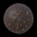
Absolutely, swapping the images is a good way to see the changes between images, I use the keyboard arrow keys back and forth to do that.
Makes me wonder, if it´s a limit only on the attament amount for uploaded images directly, or if it´s the same if you would have linked images from another site?
I reckon the swap time between linked images may be a bit longer though than actual upploaded ones?
 
PBR real-world values and basic guidelines: Non-Metal

I summarize a few rules for non-metals.
The base color can be thought of as being somewhat flat in tonality. We avoid too dark and too bright colors. For dark values, we should not go under 30-50 sRGB brightness (This is about a overall brightness, individual RGB values can also be lower). Even charcoal has sRGB values over 30: sRGB (39/39/39).

Coal_003.jpg

And we shouldn't go higher than 240 sRGB brightness.

Physically correct Specular value for common dielectrics in the Principled BSDF node is between 25 and 62.5% and up to 100% for gemstones.

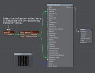
Since we rarely find information about the F0 of materials but more often the IOR, I have made a simple compound node that converts the refraction index into the Specular value for the Principled BSDF node (If this sentence makes no sense for you take a look at post #8 - The Specular Setting in the Principled BSDF node).
The node calculates the remapped Specular value from the IOR.

The setup is simple: In the IOR (Index of Refraction) input we put a Scalar node with the IOR. Then we connect Specular with Specular of the Principled BSDF node and optional Refraction Index with Refraction Index.

IOR2Specular_01.jpg

I attached the compound node below.


I also attached an lcl file (Lightwave Color Library) below. It includes a palette for the color picker with a few base colors for PBR materials.

In this way you load the library:

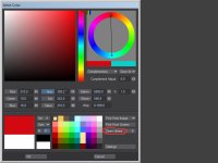
Color_Picker_LcL_01.jpg
Click on Open Library to expand the window.

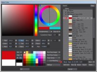
Color_Picker_LcL_02.jpg
Next select Collections and click Import. Choose PBR Material Colors sRGB.lcl.

Color_Picker_LcL_03.jpg
All colors for non-metals contain the Specular value as information in the name and, if necessary, the IOR of the material. Use this values if you want.
These should base on real world measurements. They are handy as the starting value. Have fun with it. :)

Attention: The colors are in sRGB. That means the Picked Colors in CS (Preferences) must be set to sRGB.

ciao
Thomas
p.s.: F0 (Fresnel Reflectance at 0 Degrees) means: the amount of light (in %) a material reflects exactly in the direction of the observer, taking into account the Fresnel effect and therefor the refraction index of the material.
 

Attachments

  • IOR2Specular node.zip
    1.1 KB · Views: 138
  • PBR Material Colors sRGB.zip
    1.2 KB · Views: 138
Last edited:
I summarize a few rules for non-metals.
The base color can be thought of as being somewhat flat in tonality. We avoid too dark and too bright colors.
It's a good idea to find a real reference photo with the item and use the "pick color" tool from the image.
Even charcoal has sRGB values over 30: sRGB (39/39/39).
0,0,0, ultimate black, multiplied by other scalar or color will still remain 0,0,0..
 
Thank you Thomas Leitner for putting so much work in to sharing your knowledge around PBR workflows.
I am sure it is much appreciated by many.
 
Back
Top