LW linear vs srgb which is better?

genesis1

New member
I've always used Linear colour space but some say I should be using sRGB. I've been working on a head model and find it looks far more realistic in linear. I switched to sRGB to try and it looked more like a painting than photo realistic. I didn't like it.
Is it better to be using sRGB colour ??
 
Simply stated: No. They are two different things. sRGB is a transfer curve to convert linear render data to something that is viewable (looks correct to our eyes). sRGB is an extremely narrow colour gamut/profile that was (if I recall correctly) based on the average screen colour range years and years ago.

We shouldn't be using sRGB in our rendering pipeline at all - only at the end when saving the work to a jpg or png or tiff, or similar.

Thomas made an interesting post about this a few days ago:

I quote Troy_s here. (This is a somewhat old answer, but still relevant to understand the relationship between linear and sRGB. Nowadays we work within a Filmic/ACES/wide gamut OPenColorIO configuration "to bring a significant dynamic range and lighting capabilities to your work: a closer-to-photorealistic view transform for your renders" and for rendering to HDR display technology.

"Two Sides to Colour

At the core of colour and how it is encoded into data are two loose concepts.

The first is the colour of the light, or in colour nerd terms, chromaticity. When we think of an RGB triplet of data, we have to ask ourselves what the values mean. RGB data is merely an arbitrary numerical representation of three primary lights for each of the red, green, and blue channels. If I were to say "Hey, grab a flashlight in your house that looks red and turn the slider up to 0.8-ish.", that is roughly what we are communicating when we fail to use colour spaces and colour management; we are communicating absolutely nothing.

Without associating the RGB encoded values to a colour space, we are speaking gibberish. We know nothing about the actual colour of the light on your flashlight, nor do we know what the heck 0.8 means in any meaningful representation.

In addition to the chromaticities of the primary lights, we also have what is known as a transfer function, sometimes erroneously called "gamma." This is a term that describes how the values relate to each other in intensity, where the ground truth is a radiometrically linear quantity of light in relation to a scene or a display’s output. 0.8 in our example above tells us absolutely nothing about how intense the value is in relation to the other values because we don't really know anything about the encoding system used nor how the transfer function is defined.

Colour Space

To solve the above issues, we need more information than purely the relative RGB data. We need to communicate what the values actually mean in relation to some known standards or ratios. If we know what the colours of the primary RGB lights are in absolute terms, what the transfer function ratios are for the data, and some other aspects, we could call that combination of variables a colour space; an encapsulation of a bunch of additional data not communicated with the relative RGB encoded data.


sRGB is one such creature. sRGB has very clearly defined absolute chromaticities defined for each of the red, green, blue channels, as well as a defined white point. It also includes specifications for the transfer function. These facets allow us to 'decode' the RGB values in an image and properly communicate their intention and handling through a pipeline.

Why Linear?

In practical terms, a render engine is completely blind to the colour of the lights (see chromaticity above) and merely worries about performing math on the data values. A ray tracer attempts to, as best as it can with a tri-colour or tristumulus model, emulate real-world physics when it comes to rendering.

Real world physics is pretty simple when it comes to math. One unit of light plus one unit of light is, in shockingly, two units of light. Energies operate in a linear fashion, and as such, they behave very rationally.

sRGB on the other hand, for various historical reasons and circumstances, is a non-linear colour space. That is, the transfer function portion of the colour space is bent in such a way that the values are not linearly related. 0.4 plus 0.4 in sRGB is not twice the radiometric amount of light! To see a quick visual effect of this non-linear nasty math, fill up a background in your favorite imaging application of full green and full blue for a cyan colour. Now take a fuzzy fully red brush and paint across it. See the nasty fringing? That is a result of bad and broken math due to a nonlinear reference space.

So why sRGB? If we use a linearized reference space, and we were to dump those linear values direct to the display, our display's output would look wrong. In particular, it would look extremely dark because we haven't properly "corrected" the values back to a nonlinear response. When we select sRGB in [a 3d render engine], we are telling the program to roll the linearized reference data back out through the correct nonlinear sRGB transfer curve.

If we don't do this, the data is entirely incorrect for storage in a JPEG, a TIFF, or other such nonlinear wrappers. It is also completely incorrect for viewing."
 
I'm still a bit confused lol....all I know is when I render linear it looks right on my monitor ie photo realistic and any animation I render in linear and watch on my TV looks OK too. But sRGB looks awful.
So am I right to render in Linear?
 
Do you mean specifically the output color space of the final render?

Lightwave always renders in linear color space. The output color space for final renders depends on the purpose of your renders: animation, VFX, stills for web, for print, HDRs and so on. At some point in the production, the render must be converted to the appropriate color space.
Ideally, this happens in a dedicated program (color grading, compositing or photo editing program) and not directly in Lightwave (or any other renderer).
Because in this process, called tone mapping, information is lost (unless we convert to a linear color space with wider gamut). We want to keep this information in the production chain for as long as possible so that we don't have to re-render every time the tone mapping changes. Furthermore, the default tone mapping to sRGB in Lightwave is a purely technical conversion with no control option.

For good-looking images, we don't want that. We are used to pictures (and also films) having a grading like traditional photos on photographic paper (determined by the chemical process). Even digital cameras imitate that.

For us, this means that we use linear output color space for the Final Render if possible and do the tone mapping externally.
For working in Lightwave, we set the Display color space to sRGB so that the render is displayed correctly on the monitor.

Note: If you use linear color space for final render, you should definitely use a suitable file format, preferably EXR.

If you really want to do the tone mapping in Lightwave you can use the Tonemap Pixel Filter (and sRGB Final Render color space).


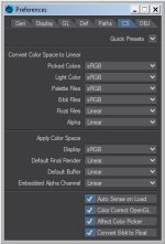
Note: The input color space for color 8-bit Files, Palette Files must be sRGB for correct color representation. Float Files and Alpha should be Linear. I also think it makes sense to set Picked Color and Light Color to sRGB.

Something like this:

CS_01.jpg

I'm still a bit confused lol....all I know is when I render linear it looks right on my monitor ie photo realistic and any animation I render in linear and watch on my TV looks OK too. But sRGB looks awful.
So am I right to render in Linear?

If you have set all settings to linear, then you have created and tweaked your surfaces under the wrong assumptions. For example, the colors you see in the color picker are not the colors that Lightwave renders with. All color textures look different on the monitor than the renderer uses them.
BTW, what lightwave version are you using? What material? You can tweak Standard material always to look somehow right.

ciao
Thomas
 
Last edited:
LW 2020.03. Oh dear yes I do have it all set on linear. But it looks OK when rendered. I'll try the settings you have shown.
I tried switching to srgb yesterday and the render looked more like a painting instead of photo realistic. It didn't pick up the details in the texture map uv'd to the face. Looked kind of flat looking too.
 
Thanks I'll take a look. I just tried changing to sRGB set up the colour space as shown above in the picture. Run a vpr test and think it looks less photo realistic. Also when I render a still and save it as a jpg, it's dark.
 
I also think it makes sense to set Picked Color and Light Color to sRGB.
I'm curious about you're reasoning for this. In 2015 The SRGB preset uses these settings, but in 2020 the sRGB preset uses Linear for both settings.

I recall seeing an explanation for using Linear for those settings in 2020 instead of sRGB, but I can't remember the source?
 
I've been experimenting and have to say I still find linear colour space more photo realistic for my model anyway.
sRGB can be beneficial exporting as exr into photoshop as a still image. Seems to give a bit more scope for adjustment. On the whole, linear seems better in LW2020. Maybe if someone can show me a work flow to get a face photo realistic using the sRGB settings in LW? I notice the shadows in sRGB are less pronounced than with linear, so that's why my model looks less photo realistic I think.
I can't see any benefit for me personally using sRGB as it seems harder to set up with less payback.
 
I'm curious about you're reasoning for this. In 2015 The SRGB preset uses these settings, but in 2020 the sRGB preset uses Linear for both settings.

I recall seeing an explanation for using Linear for those settings in 2020 instead of sRGB, but I can't remember the source?
I would also be interested in this explanation.


Everyone should use their preferred settings. So let's take a look at what's happening here:

With the Color Picker setting, we tell Lightwave what color space our input colors have. If we input the colors as linear, the renderer uses the color values as is. If we input the colors as sRGB, the renderer will convert the colors to linear before rendering. Because Lightwave renders in a linear color space.

If we simply mix a color with the Color Picker, it doesn't matter which preset we use: we see the corresponding color on the display. However, if we enter an RGB value, it behaves differently: The colors will be different.

CS_sRGB_01.jpg CS_Linear_01.jpg

In practice, this means that we cannot enter values that we have measured in an image (in a photo editing program) in the linear Color Picker without first converting it. The same goes for most of the RGB values found on the internet, such as reflection values for metals. Since the PBR rules stipulate that color maps should be in sRGB, the corresponding color values are usually also given in sRGB.

Since we only use the color picker to enter material colors, the sRGB color space hardly leads to any restrictions (of course there are color spaces with a larger gamut and therefore more colors, but we cannot see them on normal monitors and therefore in the color picker anyway). Please do not confuse with other color inputs, there it makes a difference.

That's why I use the sRGB preset for the Color Picker.

ciao
Thomas

p.s.: But of course I'm always interested in learning new things. :)
 
Last edited:
I've been experimenting and have to say I still find linear colour space more photo realistic for my model anyway.
sRGB can be beneficial exporting as exr into photoshop as a still image. Seems to give a bit more scope for adjustment. On the whole, linear seems better in LW2020. Maybe if someone can show me a work flow to get a face photo realistic using the sRGB settings in LW? I notice the shadows in sRGB are less pronounced than with linear, so that's why my model looks less photo realistic I think.
I can't see any benefit for me personally using sRGB as it seems harder to set up with less payback.
I don't think you quite understand why the colour space system exists very comprehensively.

Long story short, the main reason for setting LightWave's colour space to sRGB is to:

  1. See what your work will look like on most people's monitors/TV/display devices while you are working, because pretty much all consumer display devices use 8bit pixels and use an sRGB colour profile.
  2. To deliver a finished image or image sequence that will be directly distributed to the audience. Once LightWave has finished rendering, out it goes to the world. No further work needs to be done in other DCCs because the finished product rendered in LightWave's sRGB colour space will now be compatible with the display devices that moste audiences use.

If, on the other hand, there is more work to be done in other DCCs, then depending on project and what needs to be done, the usual workflow is to render out in the linear colour space and pass it over to the next stage in the production process' DCC so that the full colour data can be accessed for refinement.

Again, depending on the workflow, you can monitor what it will look like while you're working on it, by selecting a colour space that matches the next stage of the production workflow. i.e, sRGB, rec709, rec2020, etc.

Because you haven't told us what the next stage is for your LW renders once you've completed them, it's hard to advise what the best set up for you is.

When the last stage of the workflow is completed, it's then that the finished work will be finalised in sRGB (usually), or some other colour space (which depends on how the work will be seen).
 
Can you please post the explanation here. The facebook group is private and I don't want to join facebook.

ciao
Thomas
No problem someone had taken a screen shot of the Quick Presets in LW2015 and LW2018 and asked why they were different with 2018 now having Linear set for Picked Colors and Light Color

Ken Nign

Reply #1
The options in the top half are for linearizing a color, going from a given space to linear. Any popup set to Linear means "don't touch these colors"
In versions before we supported color space you had an implicit sRGB curve on the picked colors (roughly sRGB based on the monitor that was used when picking colors). To compensate for that the option for Picked Colors and (Picked) Light Colors can be used to remove that implicit sRGB curve to linearize them. This only makes sense for legacy assets.
But by leaving it at sRGB it would continue the paradigm of having the color values include sRGB baked in to the values.
Given that there were already going to be adjustments needed for legacy assets in LW2018, it was decided to finally break that habit and change the preset to the way it should be. Thus the numerical values are linear (and kept that way throughout the pipeline) and it's only when displayed that a color gets corrected (not including whatever output options you've set).

Reply #2
The preset remained as it was in LW2015 to maintain the best compatibility with existing assets. But you can customize it in LW2015 to match LW2018's and get the same benefit when starting new assets (linear color values, only corrected at display-time). However when it's left with sRGB for the Picked/Light Colors, then the color values would be no different than an asset from LW9.6 (because you'd end up with the same implicit sRGB curve on your colors).
If you have the Picked/Light Colors and Display all set to sRGB you'll notice that the colors displayed in the color picker (the good one
🙂
) don't look any different than if it was all set to linear (or if you were picking in 9.6, see the problem).
That's because as it's displaying the colors, the picker first linearizes based on the Picked/Light Colors' space (if not Linear) and then applies the Display space. And when those options match you end up right back where you started. And thus you haven't actually compensated for the Display space (and it looks as it would before LW10).
By having the Picked/Light Colors set to Linear and Display set to sRGB then the color picker simply applies the Display space and you're then picking a linear color value based on its corrected appearance. That's why the colors in the picker appear brighter with LW2018's preset than with LW2015's.
As for bugs fixed, I'm only aware of a fix for the Gradient node. IIRC chaining together several gradient nodes together would result in black at the end because each one was re-linearizing the input color based on the Picked Color's space. Besides fixing that we also added the Convert Color Space node in LW2018, so that if color conversions were needed they could be accomplished via that node.
I'm actually planning on discussing all this CS stuff (and the preset change) the next time I present at the LA LW Users Group, I'll try and get some graphics put together that should help explain it all.

Reply #3
I wouldn't say you were wrong, but the implications of the settings need to be known.
Picked/Light Colors set to sRGB is absolutely needed for pre-10 assets if you want to use the linear workflow. Otherwise you end up with the render too bright (implicit sRGB+the applied Display space). However the side effect is that anything you create with that setup will continue to require that setup in order to look as expected. But the side benefit is that you could continue to use those assets back in 9.6 and they would still have the expected colors.
If you were starting a new project fresh in LW2015 then you could use the LW2018-style setup or LW2015's preset and still get the benefits of linear workflow, however with the LW2018-style setup the color values that are stored in the scene/objects will be linear (that's preferred because then color-correction takes place only at display-time).
You can think of the LW2018-style setup as a "Power User" configuration for when legacy assets aren't a concern. So LW2018 now simply makes that better setup the default for the preset.

Michael Wolfe also responded.

Someone asked "But the picked and light colours need to be linear or srgb? i am not sure"

Reply #1
Linear - if the picker is corrected.
Those two settings define how the light colour is used internally and how it's saved.

Reply #2
The main differences is that the new preset assures that colours saved in LWOs (and LWSs) are independent of the CS settings.
Imho, the Picked Colors/Light Color setting should have never been there.
(and legacy assets created prior to colour spaces being added to LW converted to linear).
 
Thank you Kevin. (y)

Ken's and Michael's explanation brings me nothing new and doesn't really convince me.

But one after anonther:

Ken, about sRGB setting in Picked Colors (Preferences > CS):
"...can be used to remove that implicit sRGB curve to linearize them. This only makes sense for legacy assets."

Not just for legacy assets. Much of the information you can find on the Internet is in sRGB. How else do we get color information from materials? We measure them from photos (usually sRGB) in a photo editing program or with the Lightwave Color Picker (Pick From Screen/Image).
If we use a photo editing program, we get the values in sRGB and would have to convert it to linear.
When we use Pick From Screen/Image (Lightwave) we always get the values converted correctly according to our CS settings (it doesn't make a difference).

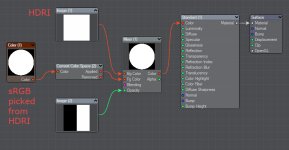
What if we pick our color values from an HDR image?
Unfortunately we cannot get the values with Pick From Screen. Neither with linear nor with sRGB setting, we never get high dynamic values.
When we use Pick From Image then it actually makes a difference which CS setting we use. With the sRGB setting, the colors are misinterpreted (I think this is poorly implemented).

And since it's HDR values, we may not see the difference on common (sRGB) monitors. Only when we dim the brightness we see that the color behave incorrectly (and of course also with all calculations of the renderer).

sRGB_p_f_I_011.png
The left half uses an HDRI, the right half with Pick From Image picked values.
Only when we dim the brightness we see the difference (sRGB preset).

Linear_p_f_I_011.png
Color picked with Linear CS looks the same even when the brightness is dimmed.


HDR images play a minor role for common material colors. But we definitely need them for luminous surfaces. In order to be able to use the values measured with Pick From Image correctly even if we use the sRGB preset, we have to convert them (quite simply in the Node Editor with the Convert Color Space node).

CS_convert_01.jpg

However, values from HDR images play a greater role in light colors. which is why I use Linear preset for Light Colors.

Ken, about storing color information with objects:
"...however with the LW2018-style setup the color values that are stored in the scene/objects will be linear (that's preferred because then color-correction takes place only at display-time)."

Yes of course that's true. To be precise: they are simply stored as RGB values without any CS settings. It also applies to Save Surface in the Surface Editor (as I have already mentioned here). The same applies to other CS settings: if a specific color space has not been specifically selected for an image (8-bit files) in the Image Editor, no CS settings will be saved when the object is saved. I think this is poorly implemented too.

But as long as you use the same CS preset it doesn't matter.
According to this knowledge, everyone has to decide which preset they want to use.

ciao
Thomas

By the way: Pick from image seems to have a bug. If you pick colors several times from an HDRI in a row, the Multiplication Factor in the Color Picker adds higher and higher.
 
Last edited:
....Maybe if someone can show me a work flow to get a face photo realistic using the sRGB settings in LW? I notice the shadows in sRGB are less pronounced than with linear, so that's why my model looks less photo realistic I think....
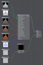
Here is an simple example using the Skin shader in LW 2020:
The node setup is very simple and almost self-explanatory. I'm using a scanned model and textures by James Busby (aka jabusby on the forums) from 3dscanstore.com that he posted a while back. Thanks. :)

Color textures include epidermis, dermis and hypodermis (also called subdermal). I name them what they are called in the skin shader.

Face_Dermis_01.jpg

The epidermis is almost colorless and on a real world scale between 0,03 and 2 mm (foot soles) thick, I use 0,1 mm (Epidermis Distance). The head object is real size. The dermis texture has the albedo color of the skin and is between 0,5 and 1,5 mm thick, I use 1,5 mm (Dermis Distance). The hypodermis texture has a very saturated color, simulating the blood and fat under the skin. It is between 0,5 and 30 mm thick, I use 6,7 mm (Hypodermis Distance).

I left all other settings at default.

The specular texture controls the Specular Weight and the glossiness/roughness texture controls the Specular Roughness. I inverted the Glossiness texture because we use it to define the roughness.

Face_Specular_01.jpg


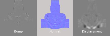
I used the bump and normal map as usual.

Face_Displacement_01.jpg

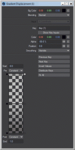
But I remapped the displacement map with a gradient to -50% to 50%. As a result, the geometry is not only displaced outwards (white) from the normals, but also inwards (black).

Gradient_01.gif

Note: To use displacement, which is plugged into Displacement of the Surface Node Editor, you still have to activate the Surface Displacement modifier in the Object Properties Primitive tab and set a height.

Skin_Shader_01.jpg

That's all for the skin setup.

Note: The skin shader renders into the Epidermis Direct, Dermis Direct, and Hypodermis Direct buffers. We can also check the noise there. To decrease it you have to increase the SSS samples. Since/When using Sheen we also need to keep an eye on the Sheen Buffer. As always, the noise in the Sheen Direct buffer, like the Specular Direct buffer, depends on the light samples.

That was the basic setup, more on the subject of linear/sRBG in a moment.

ciao
Thomas
 
Last edited:
This is true in general and not just for skin.

The best choice: use Linear for Render output color space and save it in a floating point image format (preferred exr). Do the color grading (and tone mapping) in a suitable program. In this step you now determine the grading so that it does not look too flat, for example. Save then to the desired image format, e.g. sRGB 8-bit for web.

Set the Display color space to sRGB to see the colors properly adjusted for the monitor. Here you can use the Pixel Filter Tone Map to improve the preview a bit. Again: this only affects the display on the monitor, the actual final tone mapping happens externally.

About the Tone Map Pixel Filter:
Reinhard is very similar to the default tone mapping (sRGB) and rather neutral (there is no really neutral tone mapping because a look is always established). With the pixel filter you can control the exposure and luminance. Of course, color management is already used when tweaking the material.

This is what it looks like when rendered:
I did the tone mapping in Lightwave for these examples, which you really shouldn't do (I had to re-render it every time). :)

Test_025.jpg
Reinhard tone mapping with slightly higher exposure. I find that better for adjusting the materials, exposed a little brighter and still very neutral.

Test_025_sRGB.jpg
Default sRGB


Test_025_filmic.jpg
Filmic tone mapping

Test_025_aces.jpg
Aces tone mapping

Test_025_vd1.jpg
Playing around with the Virtual Darkroom Image Filter (old fashioned photographic paper exposure).

Test_025_vd2.jpg
Again with the Virtual Darkroom Image Filter.


An advantage is that the material also works in other light situations (like outside in a winter mood):

Test_026.jpg
Reinhard tone mapping

Test_026_aces.jpg
Aces tone mapping

Test_026_vd1.jpg
Virtual Darkroom Image Filter

Note: Virtual darkroom is an Image Filter and is therefore not shown in VPR. But that's color grading anyway and should be made in an external program.

ciao
Thomas
 
Last edited:
Back
Top